So you’ve decided to go down the route of building your own website and want an awesome theme. The problem is, you don’t know how to choose the perfect one. Am I right?
Choosing a theme that makes your site pop and speaks volumes for your brand is essential. But with so many incredible ones to choose from it’s hard to know which one to pick.
There is also nothing more frustrating than a theme that is hard to use and doesn’t represent your brand in the best possible way. The last thing you want is to spend weeks fighting with a theme to try and make it look how you want.
Here’s where I step in. Luckily for you, themes are my religion!
Let me help you pinpoint exactly what you need to be looking at to help give your website a fresh lick of paint.
Don’t have time to read it all? Jump directly to the infographics!
My Seven Easy Steps For Picking A Killer Theme
In just seven simple steps you will have chosen a fantastic theme for your new business that is:
- Easy to use
- Represents you and your business in the best light
- Is designed for your customers in mind
- Gives you room to grow.
Ready to learn more? Let’s do this!
1. Choose the theme based on the look
The first thing to focus on is the look. You need to like the feel of it, the layout and the block you see in the demo. Ask yourself some questions like:
- Is the theme easy to set up and ready for you to use?
- Can you imagine your shiny new content in there?
- Can you add more custom content later?
To get you started, take a look at some of my themes to give you some idea of what I mean.
Make sure that your theme 100% matches the ethos of your brand identity. New and exciting functionalities, like e-mail sign up boxes and SEO enhancements, can easily be added down the line with plugins.
Will the theme you choose suit your business? The most important factor to consider is the layout and the space for your content.
If photography or branded images are not your strong point, make sure that the design doesn’t only rely on great imagery. If you have a lot of text, make sure there is enough space for it.
Another small buy very important point is to check whether your logo will fit in the header.
2. Responsive is key

With most of us browsing the web on our phones and tablets these days, it’s important to pick a theme that is responsive. This means the theme automatically resizes itself to look great on any size of screen.
Think about how your ideal consumer will be engaging with your content. There’s no point having a brand-new site that looks incredible on a desktop if 95% of your visitors are on their mobile phones.
Luckily, most themes nowadays are responsive, but you need to make sure you like how they look on every device especially the one used by your customers.
When I design my themes I always create 3 different designs specially tailored to the different screen size, starting by the mobile look then the tablet and finally the desktop. I ensure that your theme looks fantastic on every screen size.
Take a look here to see an example of a beautifully responsive theme in action.
3. Can the demo be imported?
So, you’ve spotted a beautiful theme online and want to download it. Now what?
In my experience, buying themes online via sites like Etsy can be frustrating. The demos look stunning, but to actually re-create that look on your own domain takes hours of tweaking and potentially even some investment in development to get it just right. All this takes up too much of your precious time, which is costly.
It’s therefore essential to be able to import all the elements from the demo easily. My themes all have a one-click installation process to save you time on the set up. You can update your theme in literally just a couple of clicks!
4. The theme’s features suit your business
My advice is to choose a theme that meets 90-95% of your existing requirements from the start. Once you get going, you can always add some plugins to enhance your site further down the line.
Don’t feel as though you need your site to be all-singing and all-dancing from the outset. It’s easy to get carried away with installing all the plugins you can get your hands on, but do your customers need these features yet?
Keep a note of the plugins you would like, for example: contact forms, E-commerce, membership area and an opt in box working in conjunction with your email provider. Once your site is up and running you can come back and implement these as and when you need them.
Be niche specific
There are many benefits to picking a theme that is specific to your niche rather than a generic one. With a niche theme, all those excess plugins, complicated coding and features you don’t need are gone. This leaves you to work with a focused theme with all the features you need to help you run your business.
When I create a bespoke theme for my customer, I work hard to understand their needs and requirements so I’m able tailor all the design and functionalities specifically to their niche:
- Hearten for coaches
- Lighten for coaches, consultant and assistant
- Motivate for VAs
- Videographer for video professionals.
If you’re feeling overwhelmed at the thought of identifying a theme that will suit your niche, my final takeaway is: remember that it’s best to have a theme that does one thing amazingly than 10 things mediocrely.
Take your time to think about the features you want and to nail the ones you feel most passionate abou
5. Does the theme support page builder?
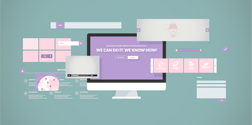
A page builder is not a mandatory tool but it will help you create more pages and blocks on your website without having to write a single line of code. Unless you have previous development experience, this can take ages. It’s far easier to purchase a theme that has one-click installation.
I think that the best page builders by far are Elementor & Visual Composer. When choosing a theme, I look for ones that support either one of these so I know I can tweak my website further down the line.
I personally love Elementor:
- it’s free (what’s not to love?)
- it offers amazing drag and drop feature that are quite easy to use.
I use Elementor in all my themes. It reassures me that my customers will be able to create their own pages easily in future.
6. Get a feel for the experience
Put yourself in your customer’s shoes to find out exactly how awesome a theme really is. You can do this by browsing other sites that are already using the theme you are interested in.
- How do others utilise fonts and layout?
- How does the user experience feel?
- Is the site clear, eye-catching and easy to read?
Seeing how other people are using the theme is the best way to get a feel for what you can achieve. If you are left feeling underwhelmed then it’s a good indication that this theme is not the perfect one for you.
As you take a look through these websites it’s worth remembering that these people are just like you. They are not tech experts. If they could pull out a great site with the theme then so will you!
7. Support when you need it
Great support is crucial for the success of your website. As a developer and business owner, providing good customer service is essential to me so I always look for themes that have fast and friendly 24/7 customer support.
- You want to be able to ask for help if you have issues installing or customizing your theme
- You want someone to be there for you when you hit a bump in the road.
More crucially, if your site went down this could mean loss of business or your own customers being unable to get in touch with you, which could seriously harm their trust in you as a brand.
Excellent customer support shows that the developer values their customers.
Your Next Steps
Whenever I design a theme, I use the seven steps above to ensure they are as beautiful and user friendly as possible.
To get you inspired, check out my theme library and see whether any catch your eye.
Other great websites I recommend taking a look at are: ThemeForest and Creative Market.
Have I covered everything or do you have any more questions about choosing the best theme for your website? I’d love to know what you think, so comment bellow or shoot me a message at here.
Like it? Pin it!


Add a Comment