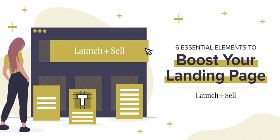
6 Essential elements to boost landing page
Did you know that by leveraging the power of a website landing page you can easily quadruple sales in your online business? Don’t believe me? Ask a successful online marketer and they will confirm that a well designed landing page is essential for boosting conversions.
Whether you seek to capture email addresses or convert a visitor to a customer, a landing page is a crucial tool in your online kit. However, designing the the perfect landing page to improve sales or attract new leads can be daunting, especially for a beginner.
Let’s take a look at the 6 essential elements that make up a well designed landing page and how easily you can replicate one for your online business.
What is a landing page?
Firstly, to answer a question that may be playing on some people’s minds. The Unbounce blog defines a landing page as: “a standalone web page, created specifically for the purposes of a marketing or advertising campaign. It’s where a visitor “lands” when they have clicked on a Google AdWords ad or similar.”
A landing page differs to the homepage of your website or blog, because it channels your visitor to only one simple action, which may be to sign up, purchase, opt in or whatever you choose.
Check out this blog post for more of a detailed comparison on the differences between a landing page and a website, which will help you decide which is best to use for your online business.
How to create a landing page – 6 key elements for design
Now we’ve covered what a landing page does, what are the best design practices for landing pages? What elements should you include in yours to ensure it is effective?
In this article we’ll answer these fundamental questions in order for you to blend the mandatory blocks in your landing page to get more sales.
Below are the six key elements for a landing page and how to implement them on your business website.
1. A compelling headline
A great headline is where it all begins. It is essential that this packs a punch as it is what will capture your prospect’s attention. It should tell him or her what you are offering in a very subtle manner.
The headline on your landing page should differentiate you from your competitors and inform your prospect what to expect. Good headlines are made up of the following:
-
Main headline
The main headline is the most critical as it is the one that first reaches out to your customer. It should be relevant and strong enough to assure the customer that they are in the right place.
-
Sub-headline
This supports the main headline by providing additional information that seeks to persuade your visitor to stay a little longer on your landing page.
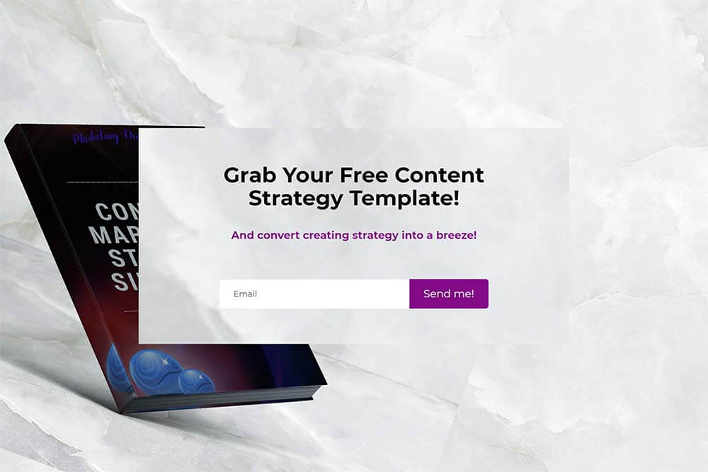
Landing Page Example #1: Lorraine from Marketing Digibook uses a landing page to sign up her audience who would like a content strategy. The main headline grabs you with a bold, easy to read statement and the sub-heading is the reason why you find yourself wanting to enter your email.
2. Visuals
Visuals on your landing page help your visitors to get a better understanding of what you are offering. To have a maximum effect on your visitors, the visuals should show the context of use which helps stir more interest and convinces them to get what you offer.
Use these types of visuals in your landing page:
-
Images
The human brain processes images far quicker than normal text. A landing page image should therefore instantly grab the attention of your visitors. The images you integrate into your landing page should accomplish the following:
- Be of high quality
- Should reach out and evoke emotion
- Inform the prospect about your brand
- Should be relevant to what you offer.
You may be tempted to add images in simply to fill up space, but be selective. Images play a part in the art of persuasion, so their role is not to be overlooked.
-
Videos
Including video in a landing page is a fantastic way to show your prospects what your business can offer. Studies have shown that consumers who have watched a product video are far more likely to make a purchase compared to those who have not. Videos are a highly effective tool to raise the confidence of a consumer and influence purchasing decisions.
Whether you choose to include image or video on your landing page – or both – make sure that they are of the highest quality. These elements are an incredibly powerful way to shape your customer’s impression of the product and service you offer.
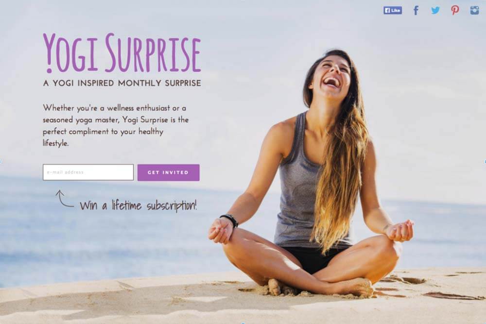
Landing Page Example #2: Yogi Surprise’s landing page is a perfect one to showcase the power of the perfect image. This image encapsulates the joy and feeling of well-being someone who may want to start or scale their yoga practice aims to have.
This landing page invites you to enter a competition and the sunny picture combined with beautiful beach setting is enough to have you signing up.
3. Value proposition
After grabbing the attention of your prospective customer via eye-catching headlines and images, you have to now answer their inevitable question: “How will this benefit me?”
In this section of your sales page, focus entirely on your customer’s needs and not on your company or business. The value proposition is where you can speak directly to your customer to solve their current problem or pain point.
Your value proposition should be presented in plain format, such as bullet points, and set out the exact benefits of your product or service. Then, you can point out some of the features to provide additional detail. Be specific and remember to highlight just how your product will help a potential customer.
4. Trust indicators
Before a visitor to your landing page is ready to sign up or make a purchase, he or she first has to be able to trust your brand or business. Testimonials and other trust indicators are key. They are an essential element of landing page design if you want to increase sales.
What are the common trust indicators you can include on your landing page?
– Customer testimonials
Using previous customer’s recommendations are highly effective on a landing page. Using testimonials will convert visitors into customers as they can see that other people have used your product or service and were happy with the result. Ensure your testimonials look genuine: include details like the full name, job title, company name and a logo/headshot to prove credibility.
– Statistical evidence
Displaying the number of customers who have already used your product or service is a great way to build trust. Be sure to include the source of your statistics to increase credibility.
– Trust badges
Add logos from other companies or brands who have successfully used your product in order to make a statement.
5. Call to action
The final element every highly converting landing page needs to include is a CTA. A Call To Action is the climax of your landing page. It is what all the other sections of your page should feed into. The Call To Action is what converts a visitor to your landing page into a lead or customer depending on the outcome you seek.
The Call To Action can either be a button – e.g. ‘buy now’ – or it can be a lead generation form to capture email addresses of people interested to hear more from you.
What is an example of a compelling call to action? Let’s take a look at some of the best design options for your call to action:
– Include a freebie
Want to know what’s the most incentivising element of any call to action? A freebie to sweeten the deal! Give your audience a reward for signing up or asking for more information by sending them something highly relevant to your offer.
-
Size
Ensure your CTA is big so that it is unmissable. It needs to send a clear message to your visitor, who should be in now doubt what the aim of the page is.
-
Position
Ever wondered where to position your call to action? Here you can experiment with a few locations on your page to see what works best. For example, you could try drawing attention to the CTA by using white space around it for a more dramatic impact. Trial A/B testing so that you can determine what the most effective position is.
-
Color
The color you choose for your CTA should draw the reader’s attention. The CTA should stand out from the rest of the landing page elements.
-
Copy
The language of the CTA should be compelling, exciting and persuasive, for example: “I want a free theme”. You don’t have many words to play with here, so again, experiment to see what resonates with your audience until you find what works.
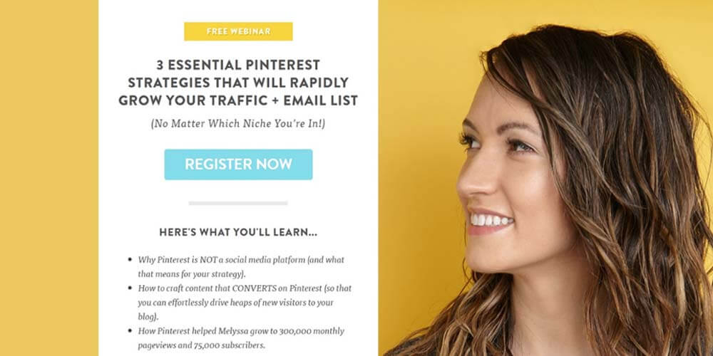
Landing Page Example #3: Melyssa from MelyssaGriffin.com offers a free Pinterest webinar that is a great example of the use of bold colour and a contrasting CTA button. The irresistible headline defines the problem the reader is facing, and the sub-title qualifies this by saying everyone is welcome, “no matter what niche”.
Melyssa is looking directly at the words “free webinar” and what she will be teaching you. This sends a powerful message to her audience that she will be divulging her secrets straight with you.
6.FAQ
Your potential customers will have tons of questions when scrolling your landing page. If your lead doubt even just a little bit it could make you lose a sale. Don’t assume people will contact you to get their answers, most of the time they’ll just delay it till later and then forget about it, which means you lost a sale.
You want to give you visitors all the answers and reassurance they need to take action and purchase from you. A good practice is to brainstorm with some ‘test subjects’ and ask them what they’re unsure about, what would make them hesitate to purchase. It will give you a good amount of questions. You could try to answer them all in the main copy but you don’t want to have endless paragraph of what if and what about… You want straight to the point copy that convince.
That doesn’t mean you shouldn’t address the potential concerns and questions. The best way to tackle these questions is ia an FAQ. It gives you the perfect space to answer all these questions and even more, to methodically knockdown any hesitations your lead may have.
You can create your own FAQ by simply doing a section with the questions in bold and the answers below, however if you address more than 5 or 6 questions, it will eat up a lot of space. The alternative and my recommendation is to use a plugin. It will allow you to have that fancy effect of the answer appearing when you click on the question (the magic of Javascript). I particularly love the HeroThemes’ FAQ plugin: it’s super easy to create your FAQ with the drag and drop system, you can choose the style that matches your website the best and you can insert the shortcode anywhere on your website.
Best landing page design to boost conversions
Designing a landing page that converts is what will set you apart from your competitors and drive sales through the roof.
Incorporating these six elements into your landing page design will ensure that you do not miss any vital features. These blocks will give you the scope to build an effective landing page that suits your business. Feel free to use this as a framework, carrying out A/B testing, to find out what works best for you and your online business.
Do you have any landing page tips to share? Have you been trying to crack the ultimate landing page design and had a breakthrough? I’d love to hear about your experiences.
Pingback: 5 Easy Ways To Optimize Your Website For Capturing Leads | ladybossblogger